 Jamie Reid,
born in 1947 is an English artist and anarchist with connections to the
Situationists. His designs
is about letters form cut out from newspapers and magazines in the style of a
word heading, came close to defining the image of punk rock where he was best
known for making a cover for the Sex Pistols album ‘‘Never Mind the Bollocks’’
and ‘‘Here's the Sex Pistols’’, and the singles "Anarchy in the UK"
& ‘‘God Save The Queen".
Jamie Reid,
born in 1947 is an English artist and anarchist with connections to the
Situationists. His designs
is about letters form cut out from newspapers and magazines in the style of a
word heading, came close to defining the image of punk rock where he was best
known for making a cover for the Sex Pistols album ‘‘Never Mind the Bollocks’’
and ‘‘Here's the Sex Pistols’’, and the singles "Anarchy in the UK"
& ‘‘God Save The Queen".
This
photograph of Queen Elizabeth II was told with an added safety pin through her
nose and swastikas in her eyes, described by Sean O'Hagan of The Observer as
"the single most iconic image of the punk era"), "Pretty
Vacant" and "Holidays in the Sun".
My thought on
this was that the sex pistol wanted to mock the queen in her early age. What is
surprising about this picture is the subject. The queen should be respected and
this image is disrespectful.
Jamie Reid uses
the size and font for the word lettering from newspapers and magazines to cover
the queen’s eyes and mouth. He scans the lettering and did it digitally.
The artist
has used these materials and techniques to create this image to shock the
audience and get their attention and also confuse them because the image
appears to be dis respectful but the wording is respectful "GOD SAVE THE
QUEEN".
This image
communicates rebellion, confusion, shock, angry, lack of respect, but it also
show the respect of wording. By covering the eyes and mouth it stops the queen
from communicating and takes her power away.
I like this
image because it uses different lettering to cover anywhere around it.
 Vincent van Gogh, born 30/03/1853 is a Dutch
post-Impressionist painter who does his paintings from emotion and bold colours
and died at the aged of 37 in 29/07/1890 from a gunshot wound. He used
drawings, oil paintings, watercolours and prints to developed his paintings
from portraits, landscapes and still lifes. He inspire his paintings from his
surroundings, where he goes, the objects he use and who he talks to, E.g.
Portraits of person, still life painting of sunflowers, landscape painting of
fields, etc. He did his paintings with every details and tones he was looking
at and makes the colour brighter and dimmer. his art movement was Post-Impressionism, Expressionism and Divisionism.
Vincent van Gogh, born 30/03/1853 is a Dutch
post-Impressionist painter who does his paintings from emotion and bold colours
and died at the aged of 37 in 29/07/1890 from a gunshot wound. He used
drawings, oil paintings, watercolours and prints to developed his paintings
from portraits, landscapes and still lifes. He inspire his paintings from his
surroundings, where he goes, the objects he use and who he talks to, E.g.
Portraits of person, still life painting of sunflowers, landscape painting of
fields, etc. He did his paintings with every details and tones he was looking
at and makes the colour brighter and dimmer. his art movement was Post-Impressionism, Expressionism and Divisionism.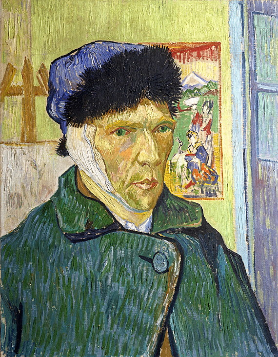 This is a portrait of Vincent van Gogh as a transcript i've done with oil pastel in my sketchbook. in the portrait he has painted a band aid covering his left ear showing how it got cut off by a painter, Paul Gauguin with a razor knife during their argument on 23th December, 1888. this portrait also shows that he was sad when his ear was cut off.


